How to Make A Professional Book Cover

FINALLY. I just put the paperback, Kindle, and PDF of my book up for sale. The iBooks version and audiobook are still in the works, but now I can show off what I’ve been working on for the past few months.
Here’s my first book – Play It Away: A Workaholic’s Cure for Anxiety.
Pretty sweet, right?
I love the cover. It perfectly captures the spirit of the main concept in my book (play). And thanks to my designer and photographer, it turned out even better than I envisioned.
In this post, I’m going to show you my entire process for creating the cover. If you’re an aspiring author who’s working on their own cover, scroll down to the bottom for my step-by-step instructions.
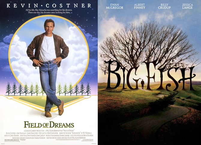
I had a concept in mind for my book’s cover very early on: playing catch on a grassy hill, on a summer’s day. I wanted the coloring to fall somewhere between the movie posters for Field of Dreams and Big Fish (two films that — for me — have always felt magical, nostalgic, and playful).
I also wanted the title to be written in a child-like font, maybe something like Where The Wild Things Are (again- magical, nostalgic, and playful).
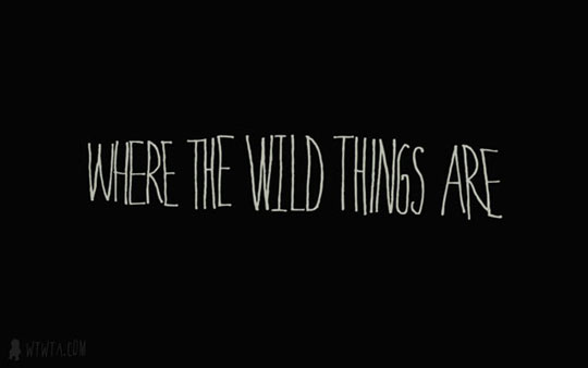
That’s what I had in mind from the start. The goal was to INSTANTLY communicate those qualities, while letting the prospective reader know that the content was about healing anxiety and managing workaholism.
At the time, I didn’t know what the title was going to be. I thought about just calling the book How I Cured My Anxiety, based on the popularity of the post. I brainstormed title ideas with Tucker Max, and he had some really good insight. I’m paraphrasing but this is basically what he said:
The problem with calling it How I Cured My Anxiety is that it hinders word-of-mouth. Think about it: If someone wants to give your book to their friend, what are they going to say? “Hey man, I have a great book that you need to read — it’s called How I Cured My Anxiety“? That’s uncomfortable because it almost sounds accusatory. “What do you mean I should read it? You think I have anxiety?” That’s not a conversation an anxious person wants to have.
Tucker came up with the title Play It Away, which made me laugh at first (very close to Pray It Away). I liked it though, so it stuck. Then I came up with A Workaholic’s Cure for Anxiety, which shows who the book is for and what the benefit to reading it will be.
I got to work on the cover a couple months ago. Like I said, I knew pretty much exactly what I wanted. I just didn’t know how hard it would be to create.
Alternative Concept
While we were out playing home run derby one day, our friend Erin Tyler came by to take some pictures. Then she whipped up a cover concept, just for fun:

And then she refined the concept to this…

Here’s what they look like side-by-side:
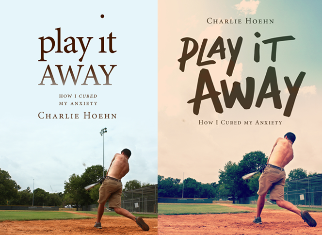
A few things I didn’t like about this first concept:
- It looks like a baseball book. If you saw it from across the room, it wouldn’t register that the content was about emotional health.
- Too brown. There’s no sunshine or light.
- The title font. Not “light” enough.
- My back was all screwed up from a cupping session I had the day before at an acupuncturist. You can see the marks in these pictures, but they were easily removed in Photoshop.
- The baseball was moved out, per my request, so it didn’t look so much like a pop up (which it was).
I did really like this picture though, and I ended up using it in the book. You can see it on pages 3 and 27.
Making the Cover
The lesson I learned while designing the icon for Negotiate It (which I wrote about here) was that if I wanted to get it done right, I had to do most of the heavy lifting myself. I couldn’t just approach my designer and say, “Come up with a bunch of ideas.” That’s a rookie mistake. The right way is to have a talk about what you’re going for, then DO MOCKUPS YOURSELF. That way, you’re able to quickly see if an idea is working or not. Even if your mockups are terrible drawings that you put on a napkin, your designer can turn them into something great.
I can’t overemphasize how important it is to come up with a concept first and to do the mockups yourself. Every author I know is inevitably disappointed with the cover concepts their publisher comes up with. But the truth is that no one understands the spirit and meaning of the book better than the person who wrote it. All authors should try to envision the exact cover they want, then draw it out on paper. Or if your cover calls for it, do a photo shoot. That’s what I did…
The first step was to find a good location for the shoot. There was a local high school baseball field that I thought would be perfect. It had a hill that I’d photographed several years before, because it reminded me of the Microsoft Bliss image. This is the picture I’d taken:
I asked my dad if he wanted to be in the cover. He was my first choice to be in it, considering we’d played catch together countless times over the years. Then I asked my friend Ryan Case — who had experience doing photo shoots and owned a super nice camera — if he was interested in helping out with my cover. Both of them agreed, and we headed over to the field.
Then the photo shoot began, where we took hundreds of shots like this, playing catch from an uncomfortably close distance while wearing formal work clothes:


Ryan sent me the shots, which I started playing around with. And for a few minutes, I really believed I was skilled enough to do the cover design by myself.
How wrong I was.
Behold… my artwork:

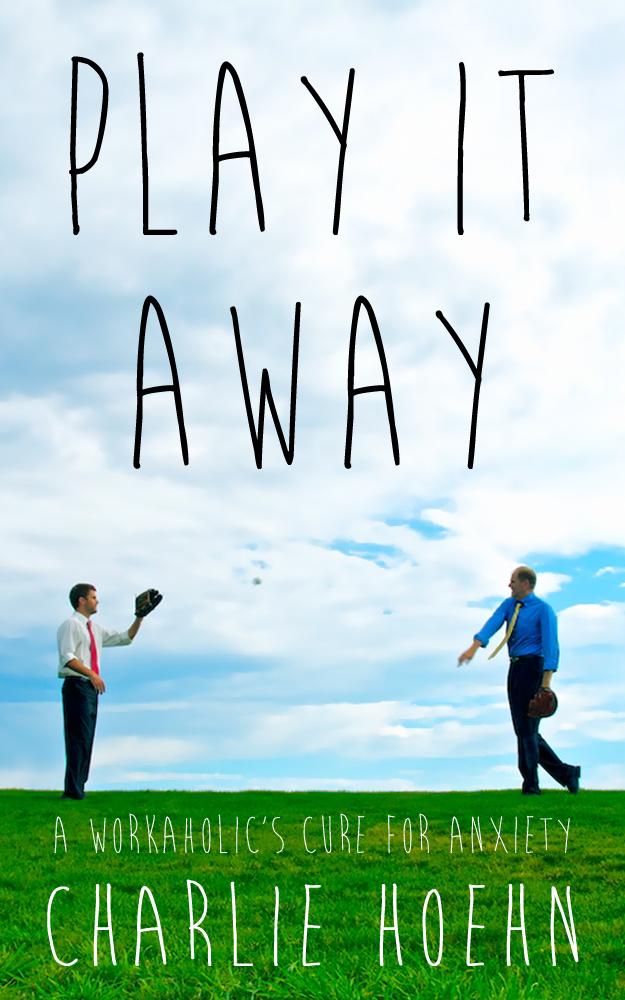

I worked on these mockups for hours. By the end, I was pretty impressed with myself.
I sent them over to Erin, thinking she’d be blown away by my brilliance. She wrote back, “Aw that looks nice! Get me that photo as hi res as possible and I’ll clean it all up for you.”
I sent her the hi-res photo at 3:44 PM on Saturday, September 21st.
At 5:53 PM — two hours and nine minutes later — she sent this back to me:

Alright, the professional designer wins!
Here’s the Before/After shot:

The main font was drawn by hand. And apparently, my dad’s throwing hand was the most difficult part of the cover because — in order to change the sky — it had to be removed and replaced with another hand (Erin found a substitute hand on Google images).
Overall, I couldn’t be more thrilled with how it turned out. Many thanks to Erin (who is currently unavailable for extra work, due to her busy schedule), Ryan, and my dad for helping out with the cover.
Ready to Make Your Own Cover?
Here are the steps you’ll need to take:
- Come up with a great title. Does your title communicate the core concept of your book? Is it clear who the book is written for, and what type of an experience the reader will get from it? Can people easily recommend your title to friends? Is it memorable and unique?
- Create a decent mockup. Draw out all the visions you have for your potential cover. Use a pen and paper, or use cutouts from magazines and glue, or whip up something in Photoshop. Make a visual for every cover concept that you think could work. Pick your favorite one. That’s what you’ll be handing over to your designer.
- Steal winning concepts from art that you love. The visuals of playing catch on a warm summer day, in front of a beautiful sky, had been established by other popular pieces of art. I latched onto familiar visuals from Big Fish, Field of Dreams, and Where The Wild Things Are, and kept them in mind during the entire process.
- Test your mockup. Look at it from all the way across the room. Can you read the title? Hand your mockup to a dozen people you think would be interested in reading your book, even if you’re embarrassed by how it looks. Do these people immediately understand what the book is about? Are they interested in the concept, or do they tilt their head?
- Hire professionals. You’re a writer, not a designer. You don’t have years of experience in Photoshop, nor do you want to start learning right now. Let a pro make your cover beautiful. Give them your mockup and tell them the winning concepts you’re aiming for. That’s all the direction they’ll need. Find and hire a designer you like (try Behance or Elance — here’s a really talented cover designer I found after a few minutes of browsing), and offer to pay them a flat fee (incorporate two iterations in the agreement, so you can make a couple minor revisions if necessary). It’s well worth the few hundred dollars you’ll spend — a great cover converts FAR better than an amateur cover.
- Review the thumbnail. Does your cover look good when you shrink it down to a tiny thumbnail? That’s how most of your readers will see it, on Amazon.
- If possible, make one more cover. Survey your friends and prospective readers, at least 30 of them. Ask which one they would click on or pick up if they saw it.
# # #
Questions? Thoughts? Leave them in the comments. Thanks for reading, and I hope you get a chance to check out the book (paperback, Kindle, or PDF).


Member discussion